Looks Like Good Design
Home
Creative Fields
Category
Advertising
Architecture
Art
Branding and Identity
Furniture
Graphic Design
Illustration
Industrial Design
Interior Design
Jewellery
Murals
Package Design
Photography
Print Layout
Product Design
Rendering
Tattoo
Textiles and Fashion
Transport
Typography
Video and Animation
For the ♥
Love
of Design!
About
Contact
Submit a Design
Submit a Design
Search Projects
Creative Fields
Branding and Identity
Coffee to Go
By Dima Je
Image Not Available.
You Might Also Like
HeforShe
By DIA
0
Buzz Launcher
By Daumkakao
0
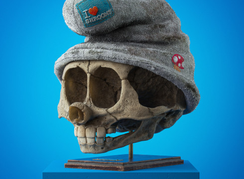
Cartoon Fossils
By Filip Hodas
0